Friday, 6 December 2013

Wednesday, 4 December 2013

Inpiration for gill sans

Gill Sans rose to popularity in 1929 when it became the standard typeface for the standard typeface for London and North Eastern Railway (LNER).

Gill Sans was the 1st successful sans-type based on humanist model of Renaissance. Gill Sans is a humanist sans serif with some geometric touches in its structures. It also has a distinctly British feel. 


Legible and modern though sometimes cheerfully idiosyncratic, the lighter weights work for text, and the bolder weights make for compelling display typography. 

History of gill sans my research! :)


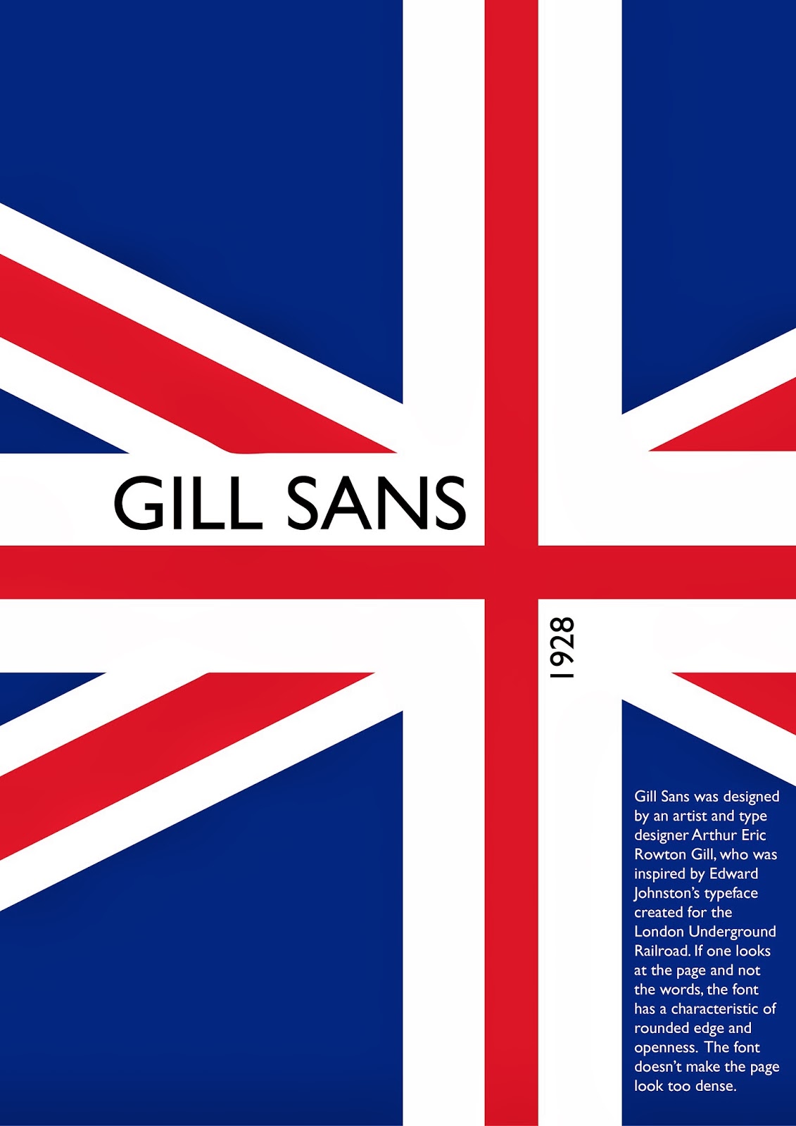
Gill Sans was designed by an artist and type designer Arthur Eric Rowton Gill, 
who was inspired by Edward Johnston’s typeface created 
for the London Underground Railroad. 

In 1882 Erik Rowton Gill born in Brighton Sussex. Eric Gill, who had studied under Johnston at London’s Central School of Arts and Crafts, later became a friend and apprentice and even had a small role assisting in creation of the proprietary typeface. 

Eric Gill was a British sculptor, typeface designer and print maker. He was associated with the Arts and Crafts movement.


If one looks at the page and not the words, the font has a characteristic of rounded edge and openness.  The font doesn’t make the page look too dense.

Colleteral need to edit!!


The typeface I have chosen for this project was Gill Sans. My inspiration for this project poster is Gill Sans as the Helvetica of England, since the font has been used as an official font for the LNER railway system, and an advertising model for British Railways.

Feed back : Not enough info. too simple. dosen't look like infography. 


Final Video~ History of Gill Sans


Tuesday, 26 November 2013

Scene 11 *Masking problem


For the jackunion i have problem figure out for the masking effect.
I get help from clement and lim and finally i got what i wanted